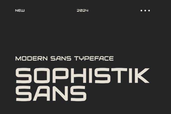
Sophistik Sans: A Modern Sans Serif for Digital Clarity
As a UI designer who ships dozens of landing pages, SaaS dashboards, and e-commerce experiences each year, I’ve learned that typography isn’t just about aesthetics—it’s functional infrastructure. Sophistik Sans is one of those rare sans serif fonts that performs as well as it looks: clean, legible, and quietly confident across every digital touchpoint.
At its core, Sophistik Sans is a humanist sans serif—designed with subtle stroke modulation, open apertures, and balanced proportions. It avoids the cold neutrality of geometric sans serifs while staying far from the decorative flourishes of display fonts. The result? A typeface that feels both contemporary and timeless, with just enough warmth to support brand voice without demanding attention.
Where Sophistik Sans Earns Its Place in Your Layout
It shines most reliably where clarity and intention matter most: hero section headlines, navigation labels, CTA buttons, product cards, and pricing tables. On a coaching website, I used Sophistik Sans for the headline “Clarity Starts Here” over a soft gradient—and the contrast between quiet confidence and visual simplicity made the message land instantly. In an online boutique’s product grid, it kept SKU names and price tags scannable at 14px on mobile, even with tight spacing.
Its optical balance makes it especially effective on dark mode interfaces. Unlike many sans serifs that blur or lose contrast against charcoal or navy backgrounds, Sophistik Sans maintains crisp letterforms—even in its Light and Regular weights. I’ve deployed it successfully on image overlays (with 70% black transparency) without needing heavy text shadows or outlines.
Readability That Adapts—Not Assumes
Responsive design isn’t just about fluid grids—it’s about how type breathes across breakpoints. Sophistik Sans includes six carefully tuned weights (Thin through Black), each with matching italics, so you can scale hierarchy without switching families. Use Thin for subtle captions, Medium for body copy at 16–18px on desktop, and Bold for section headers that need visual weight but not visual noise.
On mobile, I default to Regular or Medium at 17px line height 1.5—no tracking adjustments needed. Its generous x-height and open counters prevent crowding in small viewports, and its consistent stroke rhythm helps users scan quickly. For form labels or checkout steps, it delivers neutrality without sterility—critical when trust and conversion are tied to tone.
Brand Identity Through Consistent Typographic Voice
When your brand lives across a Shopify store, Notion course hub, Instagram carousel, and email newsletter, typographic consistency becomes part of your brand contract with users. Sophistik Sans holds up across all those contexts because it doesn’t lean too hard into any single personality: it’s not playful, not corporate, not minimalist-for-minimalism’s-sake. It simply supports *your* voice.
I recently used it across a wellness brand’s ecosystem: as the logo lockup (in Bold, all caps, tight tracking), as body copy in their blog (Medium, 18px), and as overlay text on Reels thumbnails (Light, centered). The continuity wasn’t obvious—but users reported the site “felt more cohesive” and “easier to follow.” That’s Sophistik Sans doing its job: enabling recognition without shouting.
Smart Pairings for Layered Digital Design
Sophistik Sans pairs cleanly with serif fonts for editorial depth—think Merriweather or Cormorant Garamond for blog headers or long-form content sections. It also grounds script fonts beautifully: try pairing its Regular weight with a restrained script like Playfair Display Italic for testimonial quotes or feature highlights. Avoid pairing it with other humanist sans serifs (like Lato or Open Sans)—the similarities dilute distinction.
For SaaS dashboards or analytics tools, I often combine Sophistik Sans Bold (for module titles) with a monospace font like JetBrains Mono (for code snippets or status badges). That contrast reinforces function without sacrificing harmony.
Practical Considerations for Real Projects
Sophistik Sans ships in WOFF2, WOFF, and variable font formats—so you can serve lean, adaptive files with a single @font-face declaration. It supports Latin Extended-A, Greek, and Cyrillic, making it viable for multilingual sites without fallback chaos. Ligatures and stylistic alternates are included but optional—ideal for branded headlines where you want refined polish without compromising CMS flexibility.
Licensing is straightforward: one commercial license covers unlimited web projects, client work, templates, and digital assets—including Shopify themes, Figma UI kits, and Notion workspace branding. No per-page fees, no domain limits. Just embed, declare, and go.
When to Reach for Sophistik Sans—And When Not To
Reach for it when you need:
- A hero headline that communicates sophistication without stiffness
- Navigation or filter labels that must remain legible at 14px on iOS Safari
- CTA buttons where clarity trumps decoration
- Branded PDFs, pitch decks, or social banners that reuse web typography
- Logo text for modern B2B, creative, or lifestyle brands
Avoid it for:
- Handwritten or artisanal brand identities (choose a script or textured sans instead)
- Highly technical documentation requiring monospace dominance
- Long-form editorial sites where serif body text provides stronger rhythm
In practice, Sophistik Sans has become my default “clarity anchor”—the font I reach for first when a layout feels visually noisy or tonally vague. It doesn’t solve every problem, but it removes friction. And in digital design, removing friction is often the most powerful thing you can do.